Optical font sizes in LuaLaTeX
Published on , last updated on
OpenType optical sizes are a way for a font to provide alternate designs for letters depending on the size of the letter. Since the same font is often used for different sizes of letters, it improves the legibility of those letters if optical sizes are used. In this article, we will briefly look at what optical sizes are and then how to use them in LuaLaTeX.
Typefaces, fonts, and variants
Typefaces are often used with many different styles, weights, sizes, and so on. One appearance of a typeface with a certain set of characteristics is called a font. Commonly used fonts are small caps or italics. If your browser is configured to use a well-designed typeface, you will see that the letters in the small caps or italics above are actually different from the normal text. Small caps are not just smaller letters, and italics are not just slanted versions of the upright letters.
This is where the CSS name font-variants comes from.
Note that the words font and typeface are often used interchangeably, with font also referring to the whole typeface. In the digital age, this distinction is also less clear at times. In the remainder of this article, we will use the term font.
Small caps
Let us look at one example in particular: small caps. Again, small caps are not just smaller letters. For example, a small cap letter often has the same stroke weight as a regular-sized letter, while only being as tall as the regular letter (meaning the x-height of a normal letter, which is the height of the letter x). So, while the small cap letter is smaller, the thickness of the strokes of the letter is the same as for regular letters.
For example, compare the examples below. The first one uses proper CSS to enable small caps, while the second simply uses smaller all caps (again, you need to use a well-designed font for this to work: if both look the same, change the default font of your browser).
| Real | Fake |
|---|---|
| Hello, world. | HELLO, WORLD. |
As the sizes for the fake small caps above are font-specific, here is an image of how this looks with Source Serif:


Optical sizes
The same principle exists for optical sizes. For different sizes of the font, different variants exist to improve legibility. Smaller text often has wider spacing, while a larger text has less weight.
More information is available around the internet, see What is optical sizing and how can it help your brand? from Monotype or Inside the fonts: optical sizes from Type Network.
When using such a font, the font is often available as a separate entry in your font picker, with names such as “X Caption” or “X Display”. Unfortunately, there is no one standard for which font should be used for which size.
For example, Adobe’s ranges are:
| Name | Size range |
|---|---|
| Caption | 6 - 8 pt |
| Regular | 9 - 13 pt |
| Subhead | 14 - 24 pt |
| Display | 25 - 72 pt |
Some other type foundries or families include also include Small text, Body text or Poster.
OpenType Font Variations (variable fonts)
The number of font files (and thus entries in your font picker) can quickly become a lot. For example, the Source Serif font includes four sizes (caption, small text, subhead and display), two styles (upright and italic) and six weights (extra light, light, regular, semi bold, bold and black or extra bold). Each weight is available in each style, and each combination is also available in each size. Therefore, you have 4 * 2 * 6 = 48 “different” fonts.
The solution is a relatively recent addition to OpenType: OpenType Font Variations. This allows one font to contain multiple stylistic variations, like the weights, styles, and optical sizes. Those interested in the details can read about it in the OpenType Specification.
In short, it allows the font to specify an axis and vary the font along the axis. An obvious example would be the weights: instead of defining six or more weights, the font includes a weight axis.
Using it in LuaLaTeX
In LuaLaTeX, using the fontspec package, defining a font is easy:
\usepackage{fontspec}

\setmainfont{Source Serif 4}
In an ideal world, I would hope this would be enough: when using a variable font, it should just work.
Unfortunately, this is not the world we live in. While some support for variable fonts is available, it does not yet seem very usable: see here and here. At least I could not get it to work.
There is an alternative: specifying everything manually. While that sounds like a lot of work, and it is more than I would hope, it is not that bad:
\usepackage{fontspec}

\setmainfont{Source Serif 4}[
    Renderer = OpenType,
    SizeFeatures    = {%
        {Size={-9},Font=* Caption},
        {Size={9-13},Font=*},
        {Size={14-24},Font=* Subhead},
        {Size={24-},Font=* Display}
    },
    ItalicFont      = * Italic,
    BoldFont        = * Semibold,
    BoldItalicFont  = * Semibold Italic,
]
Verifying fontspec selections
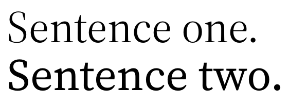
The question is now: does this work? First, we can verify that the size selection works. This is easy: just define a very different font for smaller or larger sizes and check the result.
For example, using the following:
\documentclass{article}

\usepackage{fontspec}

\setmainfont{Source Serif 4}[
    Renderer = OpenType,
    SizeFeatures    = {%
        {Size={-24},Font= Noto Sans},
        {Size={24-},Font= Source Serif 4}
    }
]

\begin{document}

\fontsize{23pt}{25pt}\selectfont

Sentence one.

\fontsize{30pt}{32pt}\selectfont

Sentence two.

\end{document}
This results in the following file:
The first sentence is clearly in a sans-serif font, which we know to be Noto Sans.
Verifying font support
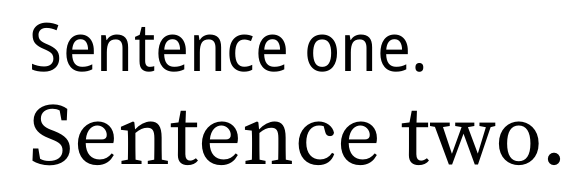
Next is verifying if our font supports this. Here, we define the same font twice: once with size variants and once without.
\documentclass{article}

\usepackage{fontspec}

\newfontfamily\with{Source Serif 4}[
    Renderer = OpenType,
    SizeFeatures    = {%
        {Size={-9},Font=* Caption},
        {Size={9-13},Font=*},
        {Size={14-24},Font=* Subhead},
        {Size={24-},Font=* Display}
    }
]

\newfontfamily\without{Source Serif 4}[
    Renderer = OpenType
]

\begin{document}

\with\fontsize{30pt}{32pt}\selectfont

Sentence one.

\without\fontsize{30pt}{32pt}\selectfont

Sentence two.
\end{document}
This results in the following file:
The first sentence is a lot lighter than the second sentence, even as we chose the same weight for both. This is expected: larger sizes of Source Serif are lighter. We can also see that not just the weight is different: the width of the first sentence is reduced compared to the second sentence.
We can thus conclude that this method works. We also have a nice way of seeing how the font sizes differ.